Questioning why and how I do art.

For this post I just want to take some time to question why I do art. Why do I draw? Why do I feel the need to produce lines and forms on paper. For many others, my peers, they started to enjoy art at a young age. Yet, I didn’t really get into art until my late teens. I had previously done art but never enjoyed it due to the fact it was always being judged from parents to teachers and too other peers. It is like when you tell someone to do something while they have already started to do it; it makes you no longer want to do it. Why? I think it is the child inside that does that. Some feel to be an artist you still need to have that childish side of you to produce ‘good’ work.

I feel this is what challenges me within this project. I like to draw for myself than for other people. I like to draw because just the movement relaxes me. I am a very patient person so when I use processes like tracing, etching and simple line drawings and messy sketches have always appealed to me. As long as I do not compare the piece to other peers, I find I can enjoy the process. Yet, I do not like the outcomes. (maybe this could develop into unfinished drawings that show my impatience to making the drawings look good due to the fact they are unfinished meaning the outcome doesn’t have to me good).

Although this questioning does lead me to- what is a ‘good’ piece of art? Is it when some one has a specific theme running throughout a series? Is it the when someone sticks to their own style?

I find it hard to develop my style of work so if I did go and stick with unfinished pieces of work should that be stopping me from developing and challenging myself. Obviously, I need to brush up on my research by talking about artists from the documentary and book of ‘ways of seeing’.

I find it challenging to use processes involving a craft element where you have to create something with 3D . It gets confusing as making work through sculptures and marks on the ground like Richard Long. “Takes drawing into sculpture and draws with fragments of nature”. (ways of seeing ep. 1) takes a lot of skill to see the outcome. It is also due to the fact I get distracted by the process itself as I end up comparing the piece.

So maybe process should be the focus. Looking into etching and repeating. Tracing over that to create something new by taking out sections of that drawing. Making a collage of these.

Again. I come up with many ideas then start it but then I do not develop it further. I struggle with  theme and making sense of what my ideas even are.

Questioning why and how I do art.

The ‘100’

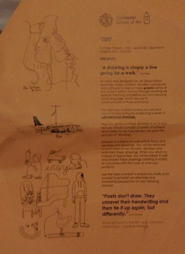
Today we were given the brief for this term which was about questioning how I approach drawing and how the perception of drawing had changed. It will help me understand why we use drawing to communicate.

First we had a discussion on what we did over the summer for our 100 drawings. As I stuck to being monochrome and simply observational my results in comparison to my peers were lacking a style.

We then went on to develop our drawings to change the scale by making a viewfinder.

how-to-make-a-view-finder

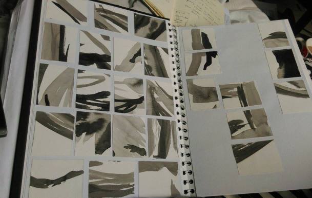
We then enlarged a section of our drawing that we found interesting which was challenging as my drawings was not very complex. This meant that once enlarged from the viewfinder the results were rather abstract.

We then used ink to redraw the selected part into a A3 drawing. I found it hard to stay with my theme as we was not observing anything yet I feel that a change of theme would be good for this project. I can still use observational drawing as a way of documentation yet not as a single theme for my series of works I will be creating. I enjoyed being able to step back from my theme and create these ink drawings and see how they changed.

Then we selected drawings for display and arrangement. We looked at how the light and dark imagery should contrast together and they all showed a different story linking me to the theme of narrative.

From here I used my scraps of paper to recreate my drawings into a more abstract outcome.

cut outs.jpg

The ‘100’

Ext. Diploma in Graphic Arts

brief-term-1

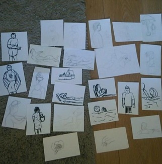
To start this term off we were given a task to complete over the summer. This involved 100 monochrome drawings with a theme of your choice. I decided to choose the theme ‘observation’ as it is something I love to do and would be doing a lot of it over the holidays. The way people act in situations has always been an interest of mine as well as psychology which is a possible direction for research. I found out there was different types of people- ones that sit by the pool and read, others listen to  music, others that stand by watching people, some are in the pool just swimming and the ones that play water-polo and other games in the water. This task was challenging due to having to question my style of drawing and to understand my reasoning for choosing to observe these people.

drawings

I originally wanted to do typography alongside my drawings but felt the task was challenging enough. I struggled to make my drawings diverse so during it I thought about doing my project based on objects we use on holiday, yet that didn’t have enough meaning to me.

From group discussion I found that I view drawing very negatively due to not being great at drawing which I felt is the reason my 100 drawings look mainly rushed and sketched. My drawings were mainly either line drawings or detailed drawings so they looked very similar to eachother. Due to working monochrome I used ink, pencil, charcoal, water colour and sharpie.  I found that ink was the best media to use to achieve the best results due to being able to change the tone and how it can be unpredictable depending on the brush. Also, I tried to use different materials and as I was on holiday there was always napkins available which made some results unpredictable due depending on the media used.


Ext. Diploma in Graphic Arts

Final Evaluation

Asher Foster 1882031872

I started the FMP by thinking about how I could change the perspective of other people in a contemporary culture on their views of nature in a social aspect. My specialism was in analogue graphics however this developed into a more digital specialism through the use of video, sound and layering the use of 2D and 4D.

I began my research by going to my space and documenting through; photographs, video recordings, sound recordings and the gathering of textures. My space is a nature reserve that is a forest with a nearby beach. It used coppicing which is a method of protecting and tidying up a nature reserve. This got me thinking about the layering of branches and how I could use layering in my work. From there I read the book Design as Art by Bruno Munari and was inspired by his quote “To complicate is simple but to simplify is complicated.” This inspired me to start making simple shapes that could lead to enlarged patterns. This introduced me to Margret Berg. She works with simple shapes and colours to create designs. This got me to look at how I can use light colours and to use my simple shapes with this style of working. When I revisited my space I found Grayson Perry’s Dream House. This gave me a new perspective of my space and how someone else would go about using it. Then, I watched a documentary informing me of his vision behind the house and he shown it through storytelling. This helped me go on and create experimental pieces and pop-up experiments with the thought of telling a story of my space with the reason behind that the contemporary culture should be more involved in these spaces. Although, I was introduced to a new documentary called, “My Beautiful Broken Brain”. This documentary used glitches and vibrant splashes of colour to show the experience the girl went through. This was inspired by David Lynch as he worked in directing films such as Twin Peaks Red Room which she was reminded of throughout her experience. This gave me the idea of connecting with my audience through using films and glitches in my work alongside quotes that I asked my peers about their experience of nature. Their views surprised me as they were very positive towards being with nature when in society it has always seen as “uncool” within my age range.

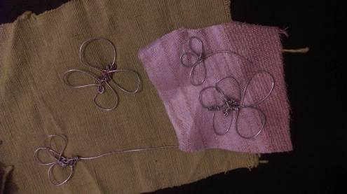
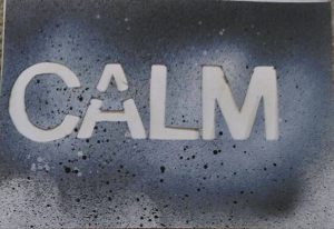
My work began by making experiments through ink based work that was done in my sketchbook. These then developed to wire with the use of line drawings of flowers. However, these were difficult to make as it takes time and is tough to do continuously and quickly. You have to be patient and it was hard to develop further other than using embroidery in relation to Lisa Kokin. Then I started thinking about other ways I could use flowers. So I used spray paint and flowers to create an outline of this using card. Most people had positive reactions to them yet they weren’t giving off the theme of a Sanctuary. I looked at the artist Lynne Avadenka, Avadenka made me think about what I have been most successful with which was typography. So I used the spray paint and created my own typeface. I used keywords that were said in my interviews yet I found that again, the spray paint didn’t give off the impression of a sanctuary. So from there I used ink with type to add colour to my work. This helped me give off the right message I was hoping for. With the typography however, I still wanted to pursue layering which is what got me to make print blocks. Instead of printing them in the print room I wanted to have something that looked fairly free so I used the print blocks with ink on card.

Overall, I wanted to communicate that everyone finds nature calming and relaxing; it shouldn’t be seen as “uncool” and it should be something that is respected. To show this I made a video of Wrabness, sounds of Wrabness, voice recordings of interviews and layering of my work over top. I felt this video was successful at giving my message across due to it being informative and a piece that pulls the audience in. Also, I had a collection of acetate pieces alongside my imagery with a projection overtop that used the same spray paint technique with flowers except I used daisies instead of roses. I got feedback for this which was that they liked the layering and how the text was displayed which was what I was trying to accomplish with this piece. Also, I was given the keywords; relaxing, open, purity and layering; which is what I wanted to accomplish with this. This year I have developed my understanding of graphics and learnt about new methods of working. My first personal project involved typography and a political theme of feminism. This guided my development and my experimentation as I had not explored the print room or type as a form of working. This then helped me with this FMP as I worked with making type into 4D which I wouldn’t have previously approached until now as this involved using moving image which I wasn’t that confident in. Next year, I want to develop my use of typography as it has been my strongest skill that I enjoy using and will allow different ways of presenting my work which would be more interesting visually. The use of moving image was effective towards my audience an further exploration of this work would challenge me further.

Final Evaluation

bibliography

BIBLIOGRAPHY

Abigail Reynolds.Abigail Reynolds. Available athttp://www.abigailreynolds.com/bibliography/ Accessed: May 9th, 2016

Alec Soth. Alec Soth.  Available at: http://alecsoth.com/photography/?page_id=3 Accessed: May 17th, 2016

Anne brooke. H-anne- MADE by Ane Brooke Textile Artist. Available at: http://www.annebrooke.co.uk/#!gallery/gcidz Accessed: May 9th, 2016

Andrew Wyeth. Andrew Wyeth. Available at: http://andrewwyeth.com/gallery/ Accessed: May 17th, 2016

Art Net. Diane Arbus. Available at: http://www.artnet.com/artists/diane-arbus/ Accessed: April 10th, 2016.

Art 21. Leonardo Drew. Available at: http://www.art21.org/artists/leonardo-drew/slideshows Accessed: April 10th, 2016.

Asha Foster. (2016) Wrabness. Available at: https://www.youtube.com/watch?v=wgTwhlV2Dz0&feature=youtu.be (Accessed: 21st April 2016)

Bilyana Palankasova. 7. Available at: http://www.7sobm.co.uk/melissa-zexter/ Accessed: April 10th 2016.

Decider. DAVID LYNCH’S ‘MY BEAUTIFUL BROKEN BRAIN’ IS AS DIFFICULT AS IT IS BEAUTIFUL. Available at: http://decider.com/2016/03/25/why-you-should-watch-my-beautiful-broken-brain/ Accessed: June 4th 2016

Explorable. Nature vs Nurture. Available at: https://explorable.com/nature-vs-nurture-debate Accessed: May 19th 2016

Fran Sorin. Gardening Gone Wild. Available at: http://gardeninggonewild.com/?p=15578 Accessed: April 10th, 2016.

Grayson Perry’s Dream House. (2015). Channel 4.  24th April.

Munari, B. (1971) Design As Art. Penguin, London.

Blank Project. Francesca Prieto. Available at: http://www.blankproject.co.uk/series Accessed: May 9th, 2016

Eva-eun-sil-han. Eva-eun-sil-han.  Available at: http://evahan.weebly.com/apophenia–2013.html Accessed: April 10th, 2016

ESCAPEINTOLIFE. Eva-eun-sil-han. Available at: http://www.escapeintolife.com/artist-watch/eva-eun-sil-han/ Accessed: April 10th, 2016

Fraenkel Gallery. EJ Bellocq. Avaliable at: https://fraenkelgallery.com/artists/ej-bellocq Accessed: May 17th, 2016

Fiona Watson. Fiona Watson. Available at: http://www.fionawatson.co.uk/about-fiona.html Accessed: April 10th, 2016

Guggenheim. Collection Online. Available at: https://www.guggenheim.org/artwork/artist/annette-messager Accessed: May 17th, 2016

Georgia O’Keefe. Georgia O’Keefe. Available at: http://www.georgiaokeeffe.net/ Accessed: May 17th, 2016.

Indiefixx. Jennifer Khoshbin. Available at: http://indiefixx.com/2009/07/01/wednesday-indie-artist-fixx-with-jennifer-khoshbin/ Accessed: May 24th 2016

JACK SHAINMAN GALLERY. El Anatsui. Available at: http://www.jackshainman.com/artists/el-anatsui/ Accessed: May 17th, 2016

JACK SHAINMAN GALLERY. Nick Cave. Available at: http://www.jackshainman.com/artists/nick-cave/ Accessed: April 10th, 2016.

James Castle. James Castle. Available at:  http://jamescastle.com/genres/ Accessed: April 10th, 2016.

John Szarkowski. Atget Photography . com. Available at: http://www.atgetphotography.com/The-Photographers/BRASSAI.html Accessed at: 17th May, 2016

Lenore Tawney. Lenore Tawney. Available at: http://lenoretawney.org/lenore-tawney/work/ Accessed: April 10th, 2016.

Lisa Kokin. Lisa Kokin Artist. Available at: http://www.lisakokin.com/cv-bibliography.html Accessed: April 10th 2016.

Margret Berg. Margret Berg Art. Avaliable at: http://www.margaretbergart.com/ Accessed: April 8 2016.

Melissa Zexter. Melissa Zexter. Available at:  http://www.melissazexter.com/about Accessed: April 10th, 2016.

Miyazaki, H (2015) My Neighbor Totoro Book, A film by Hayao Miyazaki. San Francisco, California.

MoMa. Christian Boltanski. Available at: http://www.moma.org/collection/artists/649 Accessed: May 17th, 2016

MoMA. Louise Bourgeois. Available at: http://www.moma.org/explore/collection/lb/ Accessed: April 10th, 2016.

MoMA. Weegee. Available at: http://www.moma.org/collection/artists/1842 Accessed: April 10th, 2016.

MoMA. William Kentridge. Available at: http://www.moma.org/interactives/exhibitions/2010/williamkentridge/flash/ Accessed: April 10th, 2016

Mousse Magazine. Maria Lai “To Sew Up the World” at MAN, Nuoro. Available at: http://moussemagazine.it/maria-lai-man-2014/ Accessed: April 10th, 2016.

‘My beautiful broken brain’. (2014). Netflix. 21st November.

Neverifigor. (2011)Twin Peaks- Red Room. Available at: https://youtu.be/u3IrMM0jc9M (Accessed: June 19th 2016).

Quora. Is introversion or extroversion nature or nurture? Available at: https://www.quora.com/Is-introversion-or-extroversion-nature-or-nurture Accessed: May 19th 2016

Sheila Hicks. Sheila Hicks. Available at: http://www.sheilahicks.com/ Accessed: April 10th, 2016.

Sophie Robbinson. Sophie Robbinson documentary filmmaker. Available at: http://sophie-robinson.com/about/%C2%A0 Accessed: June 4th 2016

Studio Line Juhl Hansen. Juhl Hansen. Available at: http://www.linejuhlhansen.dk/om-line Accessed: April 10th, 2016.

THE ART STORY. Eva Hesse. Available at: http://www.theartstory.org/artist-hesse-eva.htm Accessed: MAY 17th, 2016

The Guardian. My Beautiful Broken Brain: a painfully literal addition to the inspirational recovery canon. Available at: https://www.theguardian.com/film/2016/mar/19/my-beautiful-broken-brain.  Accessed: June 4th 2016

The Guardian. Robert Frank. Available at: http://www.theguardian.com/artanddesign/2014/nov/07/robert-frank-americans-photography-influence-shadows Accessed: April 10th, 2016.

The independent. My Beautiful Broken Brain: The amazing collaboration of David Lynch and a woman who ‘video-selfied’ her stroke. Available at: http://www.independent.co.uk/arts-entertainment/films/features/my-beautiful-broken-brain-the-amazing-collaboration-of-david-lynch-and-a-woman-who-video-selfied-her-a6937571.html Accessed: June 19th 2016.

The J. Paul Getty Museum. Lisette Model. Available at:  http://www.getty.edu/art/collection/artists/1521/lisette-model-american-born-austria-1901-1983/ Accessed: April 10th, 2016.

The Met. Walker Evans. Available at: http://www.metmuseum.org/toah/hd/evan/hd_evan.htm Accessed: April 10th, 2016.

The Tate. Man Ray. Available at: http://www.tate.org.uk/art/artists/man-ray-1563 Accessed: April 10th, 2016.

Tumblr. Ignacio Canales Aracil. Available at: http://el-nogal.tumblr.com/ Accessed: April 10th, 2016.

Uppercase. Abigail Reynolds, folded photographs. Available at: http://uppercase.squarespace.com/uppercase-journal/2009/11/17/abigail-reynolds-folded-photographs.html Accessed: May 9th 2016.

Valerie Solanis. SCUM manifesto. Available at: http://www.columbia.edu/itc/architecture/ockman/pdfs/feminism/solanis.pdf Accessed: May 2nd 2016.

Victoria Miro. Victoria Miro. Available at: http://www.victoria-miro.com/artists/31-yayoi-kusama/ Accessed: April 10th, 2016.

Vogue. Grayson Perry. Available at: http://www.vogue.co.uk/spy/biographies/grayson-perry-biography Accessed: April 24th 2016

Warhol. A (2016) ARTIST ROOMS: Andy Warhol. Colchester: FirstSite. 19th March − 12th June 2016.

WhenYoureGone (2014) Heather Hansen- Emptied Gestures. Available at: https://www.youtube.com/watch?v=_Spo2lE1pNY (Accessed: March 25th 2016)

White Cube. White Cube. Available at: http://whitecube.com/artists/doris_salcedo/ Accessed: May 17th, 2016


William Eggleston. William Eggleston. Available at: http://www.egglestontrust.com/ Accessed: April 10th, 2016.


bibliography

11th Week reflection 04/06/2016

Tuesday was spent sowing onto pictures as I wanted to do some experiments relating to Melissa Zexter as she sows into pictures of people and environments. I wanted to use my primary research and incorporate the idea of story telling through using natural shapes (leaves and flowers) to represent nature. Although, if I did the embroidery on images like man-made buildings it would have creates a juxtaposition which would have given off my message a lot clearer. Zexter uses embroidery to emphasise identity and femininity. Whereas I wanted to emphasise how we are rejecting nature through having built up man-made areas to having the need for large nature reserves in selected areas. I found this process challenging and the outcome would have been more effective if the images were lighter so you could see the stitching clearer.

Wednesday I started a video to help with my development which is coming together well. I have added the small videos, sounds of wrabness then I spent this time editing the voice clips and playing with special effects like pitch.  Also, I made experimental pages into acetate pages; with these I want to make a zine book including typography. This would show my analogue experimentation but through a media that can reach my audience of contemporary culture. I changed how I was going to approach my project through this as I originally wanted it to be through an all analogue process with untouched digital. Yet, once I thought about the message I am trying to give off it made more sense to have the analogue in this format. Although, the original message has changed slightly from contemporary culture being against nature and not as connected to it, yet due to interviews I have found that most people react to nature as a peaceful place that they just wouldn’t share with another person.

Thursday I furthered my editing by adding a clip of me walking around wrabness at my feet. Though, this was still bland so I added my experimental work overtop of the video that make the video look like there is a glitch throughout. The glitching video is inspired by my beautiful broken brain. https://www.theguardian.com/film/2016/mar/19/my-beautiful-broken-brain. Which was described as David Lynch’s…… http://decider.com/2016/03/25/why-you-should-watch-my-beautiful-broken-brain/

http://sophie-robinson.com/about/ lotje sodderland

Experimental work like this:

gif

Saturday I used my block prints and printed with inks to make patterns. I plan to make them into acetate then overlay them onto of primary research images.

Sunday I sowed into pictures and wire into fabric. I found that the pictures took a lot of time and the end result you couldn’t see clearly. Wire into fabric helped

wire into fabric

Goals

Finish video by adding title and any extra effects


11th Week reflection 04/06/2016

Margaret Berg

Margaret Berg uses simplified shapes in her work to create simple designs for cards, magazines and product design. Her work mainly involves illustration, watercolour and type. My work has been inspired by hers through the simple shapes and designs of flowers and leaves that I interpreted into patterns. Not only this, I created a print block that I can use in the print room to explore this style further. Yet, I haven’t managed to get into the print room. With this method, there is only so far you could go with it that I ended in a dead end. Yet, this method also made it a playful design that gives off the idea of them being related to childhood. I can take this further through photocopying these and enlarging them. With my colourful one I could use it as a background with my typography on acetate overtop. I could try this the other way too with the colour version on acetate.


Margaret Berg

10th week Reflection 30/05/2016

On Tuesday I photographed my best work for my portfolio and  unit 9 work which was comparing portfolios with what they do well which helped me have an understanding of what my portfolio should be like professionally.  It made me think that for it to have most impact of my work has to have a subject like analogue graphics so a potential client can look at my work and understand what I do and whether they want me for the job.

On Wednesday I cut up some wood to make some print blocks and some foam which I glued with pva and left it over night. I chose to do these with the simple continuous shapes I have been using throughout my project. To extend on last weeks realisation of the project not going as well as I hoped I decided to make lettering for spray paint.

On Thursday I began editing my videos and voice clips on the macs. I mainly worked on the voice clips and overlayed them so they answer the same questions together. I was advised to add an extra clip of me walking around Wrabness to fill in the gaps that my photos have- with this I could overlay that with the other videos as it makes a more mystical effect. I added varnish to my blocks for printing and leaving them to dry over the weekend and I hope to print with these next week as well as do some typography. I also made my flickr portfolio which now that it is up looks more typography based than anything which links into what I am thinking of doing in the future.

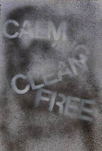
On Friday I made more lettering using quotes from interviews with key words like; calming, trees, fields, birds and grass. Then on Saturday I made some videos of me walking around Wrabness to extend on my video. Also, I spray painted using the type that I made. Although, I found that because I only had black and white spray paint meant that the results looked very dark and actually juxtaposed the meaning of the words that I was meant to. If mixed with acetate then on a projector would make a bigger effect due to them being so bold; yet I still think there needs to be colour involved.

On Sunday I decided to play with colour and type using ink.

The colour overlayed with my spraypaint would give off a better idea.

This week I want to develop my work through creating a zine and editing my video. Also, I need to go to the printroom to develop my Margret Berg inspired work as well as Marianne Keating’s work.

I will make my artist research more obvious by making clear posts of the artists that have inspired most.

10th week Reflection 30/05/2016

Revisiting my proposal

At the start of this project we make a project proposal which I said I would specialise in analogue graphics. I have explored around analogue graphics through work done in a storybook which I need to write about. I have stuck to using Wrabness as inspiration of my project and have done a lot lot of small sketchbook work but not enough furthering of ideas. It has mainly been using simplifying of shapes and extending weave and spray paint. I wanted to explore pop-up and I have done some experimentation with this but find it challenging to extend any further.

I explained in the proposal that I wished to look at print room techniques but due to choosing different workshops than I originally intended it has been more analogue through Stewarts workshop and more based on pattern due to Aerons. I hope to still use print however through print blocks and typography.

I have looked at Juhl Hansens work yet it has only inspired me through the use of mixed media experimentation. Lisa Kokin …..

Also, I wanted to reflect on my blog which I have done throughout. I just need to make connections of my research and work and make my research more obvious on both my sketchbook and blog.

I now wish to explore analogue through making various experiments with booklets. Putting work together into a zine. Talking about my artists- how they have been selective and useful. I wish to finish a video and show how people naturally are connected to nature and find it peaceful yet do not like to share the experience with others.

Revisiting my proposal